Description
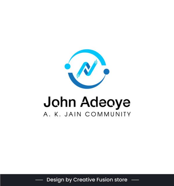
The John Adeoye logo is a modern and well-structured design, symbolizing unity, trust, and professionalism. The centerpiece is a stylized letter “N”, crafted using two intersecting blue lines, positioned inside a circular frame with two smaller circles on either side. This shape represents connection, inclusivity, and balance—qualities that align with the A.K. Jain Community.
Below the symbol, “John Adeoye” is prominently displayed in a bold black font, ensuring strong visibility. Beneath it, “A.K. JAIN COMMUNITY” is presented in a clean, smaller font, reinforcing a sense of structure and identity. Set against a white background, the blue color scheme adds a touch of professionalism and trustworthiness, making this logo versatile and impactful for branding across various platforms.
Designed by Creative Fusion Store, this simple yet memorable logo is perfect for a community-based initiative, professional organization, or corporate identity. Its minimalist yet meaningful design makes it an effective visual representation of the John Adeoye A.K. Jain Community! 🔵💼💡


 Serene Buddha Logo – Symbol of Peace, Wisdom & Enlightenment
Reviews
There are no reviews yet.